Jump to 'How to optimise your Commonplace'
What is meant by ‘Optimising your Commonplace’?
This means designing with the user in mind, geared to engage and counter immediate blocker’s to engagement - short attention spans, difficult or lengthy interactions, and unclear messaging.
Top Tip
Always put yourself in the shoes of the user when designing and building. You should also keep an eye out for pdf links or hyperlinks that could potentially take the visitor away from the engagement page.
How to optimise your Commonplace
1. Mobile first - 66% of Commonplace site visits happen on mobile and the number is rising. Our edit-mode is centred around the mobile view functionality so pay attention to the way it looks like for mobile users whilst you are building.

2. Powerful ‘Hero’ with a clear call to action - This is the banner at the top of the landing page and it is the first thing that visitors see when they visit the website. Here, we should have a strong headline with a clear call-to-action such as ‘Have your say’.
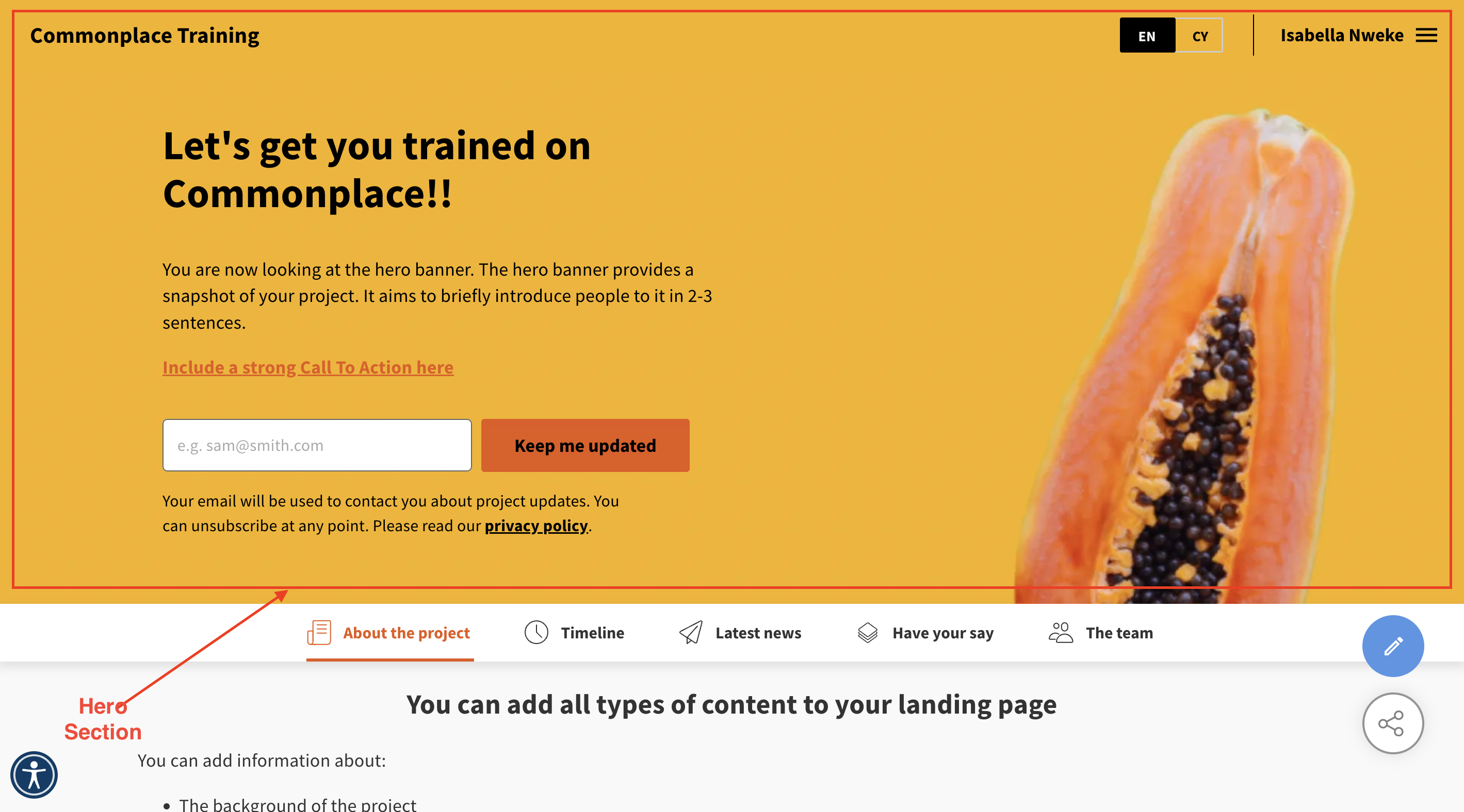
3. Short Introduction in the Hero banner - this introduction needs to capture all that the visitor needs to know about the project in a short passage. It should be welcoming and informative.
4. Hero image - using an image in the Hero is an effective way to engage the audience. If your project is about a specific local area, a recognisable landmark will be a great way to make the connection about what the project is about.
Once you have put your header section together, preview it across devices and ask some people who are not involved in the project whether they understand what it is about and make adjustments.
5. Headline of a tile: orientate and motivate - Like the headline on the main website, the headline within a tile tells the user what the tile is about. If you can embed a call-to-action, great! If not, maybe a question is a great way to draw the user into the topic? (see what we did here?)
6. Text: As much as necessary, as little as possible - Large pieces of text will scare users off, so if possible format the text to make them more engaging: use subheadings or bullet points.
Keep the text on the tiles where you are looking for contributions as concise as possible and give people the option to find out more on separate tiles or by sharing a link to a PDF for them to read. Try to make the language as easy to understand as possible, staying clear of jargon and using short sentences.
7. Provide visual aids - break up the text in your tiles with images/ sketches of the new plans, images of the local area or even use appropriate stock images to lighten up your content. This helps to keep the visitors engaged and also provides them with more understanding.
8. Check user flow - when making the final edits, you should design the content of the tiles in a way that has a logical flow and at the end of each tile give users a sentence that motivates them to go to the next one.
Contact Support
If you find you still have some questions or you’re unsure about something, please don’t hesitate to get in touch with our dedicated technical Customer Support Team