.png)

4 min read
The 2.0 dashboard is now officially live! Meet your powerful new charts, additional data-manipulation features and a more convenient and visual approach, meaning you really can learn what you need to know at a glance.
Albert Einstein famously once said, “Not everything that can be counted counts and not everything that counts can be counted.” As true as this might sound, the new Commonplace dashboard does a good job proving otherwise. Your new data companion goes above and beyond to ensure the feedback that counts is easily accessed and interpreted by you. The changes made mean you can say goodbye to your old excel sheets (unless you still really want to use it).
Put simply, the changes enable you to better manage your project performance, extract data, effortlessly analyse and understand respondents and their comments.
The best part is if you already have a 2.0 project, then your new dashboard is already active and waiting to delight you with amazing insights, which you can access by clicking on the yellow “Try your new dashboard now” button in your current dashboard.
We have a webinar exclusive to you, so let's explore what’s new!
Follow the other 70% of our users that have adopted the New Dashboard

The new dashboard
Your visitors
.gif?width=900&name=Community%20Project%20(4).gif) Firstly, the appearance of the dashboard has changed quite significantly. Instead of four columns providing high-level statistics, the new dashboard homepage is the ‘Visitors’ page, presenting you with a clean line graph tracking how many visitors your project has received and where they have come from (don't worry, a menu on the left-hand side of the page is where you navigate to get the information you used to see on respondents and contributions - and more).
Firstly, the appearance of the dashboard has changed quite significantly. Instead of four columns providing high-level statistics, the new dashboard homepage is the ‘Visitors’ page, presenting you with a clean line graph tracking how many visitors your project has received and where they have come from (don't worry, a menu on the left-hand side of the page is where you navigate to get the information you used to see on respondents and contributions - and more).
Instant understanding of project health…
Straight away, you know how well your project has done over a set period, and whether or not you need to prioritise getting visitors to the project, using email marketing for instance.
This, alongside the two other tables shown on your dashboard homepage, means you’re presented with a clear idea of where your project stands, and how many people are actually informed about the details of your project.
…We’re still all about the detail
.png?width=1201&name=Community%20Project%20(1201%20%C3%97%20350px).png) You don't have to travel far for more information about your visitors. The two additional tables on the page present information about how engaged and informed your visitors are (hovering your cursor over the visitor categories will reveal what each visitor type means (as per the image above), and which campaigns brought the visitors to your page, and of those, who commented and subscribed.
You don't have to travel far for more information about your visitors. The two additional tables on the page present information about how engaged and informed your visitors are (hovering your cursor over the visitor categories will reveal what each visitor type means (as per the image above), and which campaigns brought the visitors to your page, and of those, who commented and subscribed.
The funnel-like structure of this first page, like the rest of the new dashboard, is clear and easy to navigate.
If you are a customer and you have recently launched or are thinking of switching your project to a 2.0 dashboard, we’ll save you a spot on our webinar this Thursday at 11.00 AM GMT 😉.
Hear more about the evolved dashboard at our next webinar.

New tables
All of the changes to the dashboard have been made so that the data and the dashboard can do the work for you. The tables, therefore, have been adapted so that the information is clearly summarised and displayed, giving you a holistic view of the data.
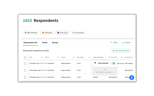
The table on the Respondents' page, showing demographic data, has been revamped for an easier reading experience, and you can choose to hide certain columns to further simplify the information being displayed. This is done simply by hovering over the column title and clicking on the green eye icon.
 The table on the Contributions page has been improved so that the data is a lot easier to understand. You might remember the Contributions previously formed a list of comments which was harder to summarise and group.
Grouping respondents and closing the loop
With all of the new filtering functionality, grouping respondents according to address, sentiment, or connection to the area is now more efficient. Grouping respondents in this way enables you to send out mass communications, but at the same time relevant. Replying in this way is easy for you, but still encourages the respondent to stay engaged, as the communication was relevant to them.
New filters
For all of the tables, the option to export and filter has been more conveniently located, and we offer new filtering possibilities, meaning you can limitlessly tease the data without even having to actually use the export button. The new filters categories include date, sentiment and proposal.
Even better, once you have applied some filters, you can click the ‘Charts’ tab, visible at the top of the table, and the data will be displayed in chart form, in line with the filters you’ve applied!
Speaking of the charts…
New 2.0 charts
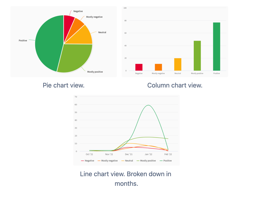
%20(1).gif?width=1000&name=Community%20Project%20(600%20%C3%97%20751px)%20(1).gif) The new, responsive, versatile charts are a more powerful and accessible way to display the information summarised in the tables. They differ from the static charts of old as they can be filtered and pivoted to accurately display the information you need, the range of colours used makes the information stand out, and as they are based on the data in the tables, you can now choose whether you would like the data to be displayed as a pie chart, a bar chart, or a line chart.
The new, responsive, versatile charts are a more powerful and accessible way to display the information summarised in the tables. They differ from the static charts of old as they can be filtered and pivoted to accurately display the information you need, the range of colours used makes the information stand out, and as they are based on the data in the tables, you can now choose whether you would like the data to be displayed as a pie chart, a bar chart, or a line chart.
 For the Contributions section, there are also priority charts and wordcloud charts available, as another engaging and accessible means to display the formerly “harder to digest’ information.
%20(1).png?width=1000&name=Community%20Project%20(600%20%C3%97%20751px)%20(1).png) We’ve also introduced a handy new feature that allows you to pivot contributions data against demographics questions asked to respondents as well as other properties (device type, groups, etc.). We call these the Pivot charts.
We’ve also introduced a handy new feature that allows you to pivot contributions data against demographics questions asked to respondents as well as other properties (device type, groups, etc.). We call these the Pivot charts.
.png?width=494&name=Community%20Project%20(14).png) As well as new chart types, we’ve made some of them customisable; despite how adaptable they are, they are nonetheless very intuitive and can be used by anyone, before receiving any training, and you run no risk of misinterpreting the data as all data exploring can be done within the Commonplace dashboard. We’ve also created the charts so that they’re all easily downloaded and printed to be included in any formal document or presentation.
As well as new chart types, we’ve made some of them customisable; despite how adaptable they are, they are nonetheless very intuitive and can be used by anyone, before receiving any training, and you run no risk of misinterpreting the data as all data exploring can be done within the Commonplace dashboard. We’ve also created the charts so that they’re all easily downloaded and printed to be included in any formal document or presentation.
Coming soon…
Although so much has changed already, we’ve got more new features and functionalities to bring your way. Soon enough you will be able to adapt the dashboard to your branding, there will be an onboarding self-service page, map analysis, custom tab reports, and so much more. We don’t want to give it all away, so join us for Thursday’s webinar at 11 am and for an exclusive look around all that’s to come.
All these great features are available to users of Commonplace 2.0. If you are yet to enjoy our brilliant new platform, including the new dashboard, please contact your Customer Success Manager.
Speak to the team about launching a 2.0 project.