.png)

6 min read
Albert Einstein once said, “You can’t use an old map to explore a new world”. That’s why we’ve evolved the iconic Commonplace Community Heatmap, giving you new insight into your neighbourhoods and cities.
Like the rest of the Commonplace 2.0 platform, the new Heatmap is designed to help you reach your community, engage people visually and geographically, power up your analysis and deliver on collaboration objectives. We’ve delivered extra gems to help communities navigate your projects with fresh ease and context.
Read on to meet your all-new geospatial engagement companion.
Navigate
Signpost using points, landmarks and polygons
Maps are used to help you find your way, so we’ve created functionality to help users navigate to different proposals using the 2.0 map. Draw or import (we love all types of shapefiles and geojson) a custom navigation layer onto the map using any kind of shape. Position a pin, polygon or circle to draw users’ attention to key areas or places. You can then add hover panels, offering more images and information about each location and also link users to another proposal or page. 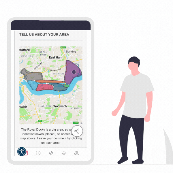
Navigating to a proposal from the map gives users another chance to see proposed plans in a geographical context and in relation to feedback already provided for that area. When it comes to the pins, you can fully customise them to your needs, using branded imagery to highlight key landmarks. Feature your navigational map on any page within your Commonplace project.
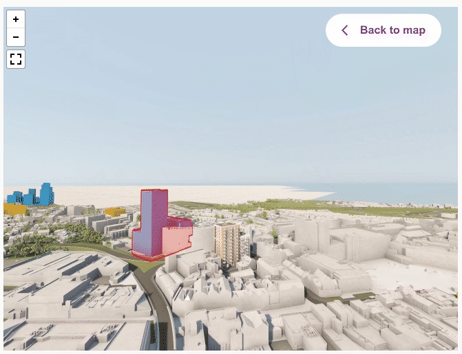
View the world in satellite, or even 3D
The new 2.0 map features a switch between map mode and satellite view, by default. The switch (as with everything in this new version) is optimised for the mobile user, making it really easy to flip between views. Keen to customise the map? We offer the most accessible and easily understandable map on the market as standard, but if you wish to change colours or styles, do get in touch with your account manager.
Ready to take community engagement to the next level? We enable views of the landscape in 3D, allowing users to see the world from a birds-eye or street view level, through our partnership with Vu.City. We’re currently exploring ways in which, one day, the community will be able to drop pins whilst viewing projects in 3D, from the exterior or interior view of the building. Right now, you can add your proposed 3D designs into their 3D context, enabling the community to view the proposals in-situ and to scale. Yet, even if your project doesn’t include 3D modelling, the community can see their area in 3D, providing vital context to imagine change and place their thoughts within the spaces.
Masterplan overlay
The flexibility of the Community Heatmap allows you to import any kind of data layer. A visual layer is the most requested, particularly for projects of a hyperlocal nature. Want to show the impacts of a new traffic junction? Keen to display how a masterplan will sit in the context of the existing landscape? Both of those are possible by superimposing your image on top of the map. This is super helpful for inviting users to engage on the wider area impacts, not just on the specific proposal design.
BETA: Data layer infinity
The options around displaying geographical data are limitless. Switch on socio-demographic layers such as income, car ownership, age, health and hundreds of other common indicators. The mechanism used is typically to colour code polygons (at postal district or super output area level) based on the chosen metric's sliding scale or geographical distribution.
Alternatively, bring in specialist data types to be displayed as polygons, lines or perhaps even grids. We've helped engagement teams set up and display map-based walkability, air quality and re-wilding data layers. The power of maps is limitless, and we're always happy to explore your needs and work together on customising the map for your audience.
Layers can be turned on and off by you or respondent users. You can also make more complex layers available exclusively to your engagement team to give you the insight you need, without confusing members of the respondent community.
Don't forget the basics
Remember geography lessons at school? Your teacher would always insist on having the vital map ingredients present: scale bar, legend, north arrow... The new digital world has elevated a new set of standards which we ensure are always available.
- Search any location on the map, using town name, postcode, address, business or place name
- Set a default max and minimum zoom level
- Intuitive pan, zoom and re-centre, all optimised for mobile users
- Customise your legend to help users navigate
The all-important 'landing page'
The new Community Heatmap comes with a significant upgrade to the user journey. With our legacy map, landing a user directly onto a map page made little sense, due to the lack of space to explain the goals of the Community Heatmap. Our new mobile-optimised journey adds the concept of a welcome panel, which quickly explains the nature of your project and invites users into the engagement phase without needing to switch pages or find their way around.
In situations where you don't wish to land users directly on the map, our new 2.0 approach means you'll host Design Feedback tiles, directly alongside Community Heatmap tiles on your project hub page. This brings more flexibility and power to your engagement journey, reducing the need for respondents to jump between different project subdomains.
Engage
Follow the live conversation
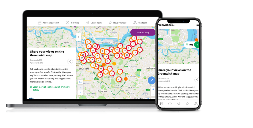
Landing on a Community Heatmap and seeing the pins, which were already added by neighbouring residents, local businesses or community stakeholders delivers an instant call-to-action for users. Curious users want to go beyond the pin's colour code and read the detail of what other local people said. We've optimised this journey in two key ways:
- Pie chart cluster pins: previously our Community Heatmaps would cluster individual comment pins into cluster pins and rely on the dominant sentiment to determine the colour of the pin. Our new pie chart cluster pins are far more accurate, giving transparency to the distribution of sentiment or opinion.
- Mobile first: our 2.0 Community Heatmap is optimised for mobile users making the experience of tapping on cluster pins and opening up the detailed responses behind individual pins more intuitive.
BETA: Pins no longer only about sentiment
We've recently gone live with a new feature in BETA testing. This allows you to display your pins based on a non-sentiment question. So you may wish to colour-code pins based on a user's preferred transport mode or connection to the area. This is all possible by referencing the colour-coding to another question or even fully customising the pin image to, say, a car, a bicycle and a pedestrian.
Jump in and 'have your say'
From our web analytics insights, we know that users who explore what's already been said or over four times more likely to make their own contribution. The new 'have your say' user flow has seen a number of improvements to the user interface, making the call to action clearer (particularly for mobile users) and the follow-up interactions more intuitive. Respondents simply drop a pin on the location they wish to comment on. This is equally effective on a highly zoomed-in construction project or using wider geography of a town, city or even to the national level.
The map survey panel can accommodate any of our question types (including the all-new voice capture) and help you capture the full essence of what respondents have to say about their local area. Check out these examples to see how a Community Heatmap can be customised to different types of projects:
- Development / regeneration
- Climate emergency
- Community safety
- Active travel
Because, these are map-based projects, we always recommend including two questions in the demographics section of your contribution flow: postcode and 'connection to the area'. If you'd like to learn more about these, do get in touch with your account manager.
COMING SOON! We plan to add new ways of contributing via the map. Not only by dropping a pin, but also by drawing a line (for example collecting data on cycle to work routes) or a polygon (for example receiving suggested locations in a 'call for sites' process).
ALSO COMING SOON, ACTUALLY REALLY SOON! We're working on a new 'question type', whereby respondents can upload a photo with their comments. This means users can comment directly from where they are stood, in the streetscape. Capturing an image of the place/issue they want to comment about can help bring a great deal more insight to your team.
To find out more about launching a 2.0 project, speak to a member of the team!

Analyse
The real power to engagement partners comes through the analytical power of the Community Heatmap, in particular the geo-spatial element.
Geo-filtering
With the simple click of a button, you can filter the pins for certain responses. Keen to see only the pins with positive sentiment? Or the responses where sentiment was positive AND the mode of transport used is cycling? Or search for contributions where a free text response contains a keyword (that bit's still being finalised)?
Our new geo-filters allow you to view the distribution of certain responses and trends. This allows you to tailor future campaigns or re-engage your audience in another stage. For example, you might find that the majority of respondents with a negative attitude to cycling live in an area with limited cycling infrastructure. And chose to run an engagement campaign on some cycling infrastructure design options within that targeted area.
In reverse...
The other way to go about this is to summarise the responses within a certain geography. How did people respond in postal district A versus B? Or to the west or east of the railway? Yes, you can draw custom polygons (and in the future walk time/drive time isochrones) to understand and compare the responses in each area. This is also helpful for planning out future campaigns, but also vital to engagement partners needing to share insights and conclusions (say, through a Statement of Community Involvement) publicly with the community.
Exporting and integrations
We described earlier how you can import data layers into your Community Heatmap. You can also take all of your contribution data and plot it within any GIS (geographical information system) already in use in your organisation. There are a couple of ways of doing this:
- Export the contributions table in your dashboard, it will always come with latitude and longitude data (plus respondent postcode if you requested that information)
- Reverse geocoding the latitude & longitude to determine the postal sector, district, street name or whichever geo data you wish to use for filtering or pivoting purposes
When can you start using the new Community Heatmap?
We're already deploying Heatmap 2.0 to all new Commonplace projects. By 30th June 2022, we'll be looking to transition all historical Commonplaces to the new Heatmap, enabling all past projects to also benefit from the new features.
If you'd like to transition a project before the end of June, get in touch and we'll get the ball rolling!
