.png)

2 min read
We've refreshed the Commonplace brand, we hope you like it!
We started Commonplace because we wanted to help local communities connect with and shape the places they live, work and play. The past 5 years have emphasised just how much progress was needed.
Momentum has grown as the rate of change has intensified. Our expertise and influence has extended and our best in class technology makes it easier for our team to do great work. As the business evolves, so too must the way in which we communicate. Our brand refresh showcases the progress we have achieved.
Staying true to our social purpose
We've always believed the best way to engage people is through facilitating conversations. Allowing residents to easily share their voices, views and visions through an open conversation with developers and local authorities. This is paramount to everything we do. Our platform helps you to develop better places by hosting these conversations and gathering the data that will help shape the fabric of people's neighbourhoods. In essence:
'We bring together those able to make places by providing an easily accessible platform to facilitate community conversations and create more inclusive planning decisions.’
Creating a new visual identity
Our social purpose is what drives us to improve. It's key to what we do and how we deliver value for our customers and the communities they work in. We have set out to represent how we do things in a connected, community led way: - A friendly, more engaging approach that focuses on sparking conversations and helps move people away from the previous norm of conflict and self interest. We believe our new visual identity brings this aspiration to life.
We engaged with the design agency ZZ&D to help us refresh our branding and incorporate it across our communications. This started with our logo. Our old logo focused on places, but not necessarily the conversation we generate to shape those places. The teardrop map marker has served us well, but only represented a small fraction of our platform - the community heat-map tool. This was the first thing we looked at changing:
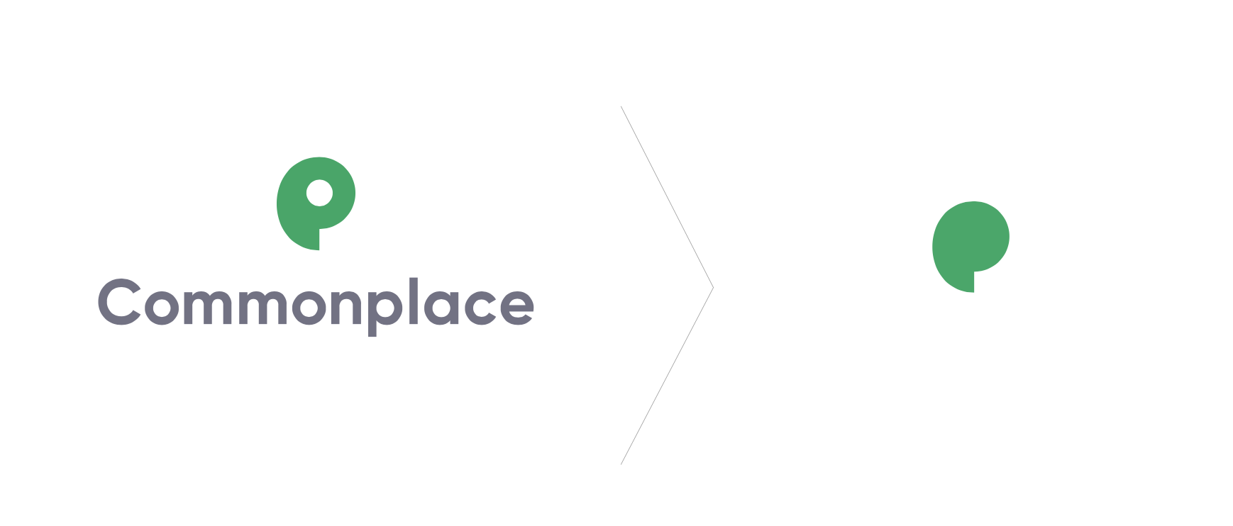
The base shape of our new logo can be used as a quote mark and speech bubble. This can still be used as a marker but is now more relevant to what we set out to achieve for communities and our customers. The new shape gives us visual assets to work with and, when combined with a new colour palette, helps to bring some of our branding to life:
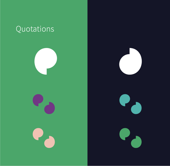
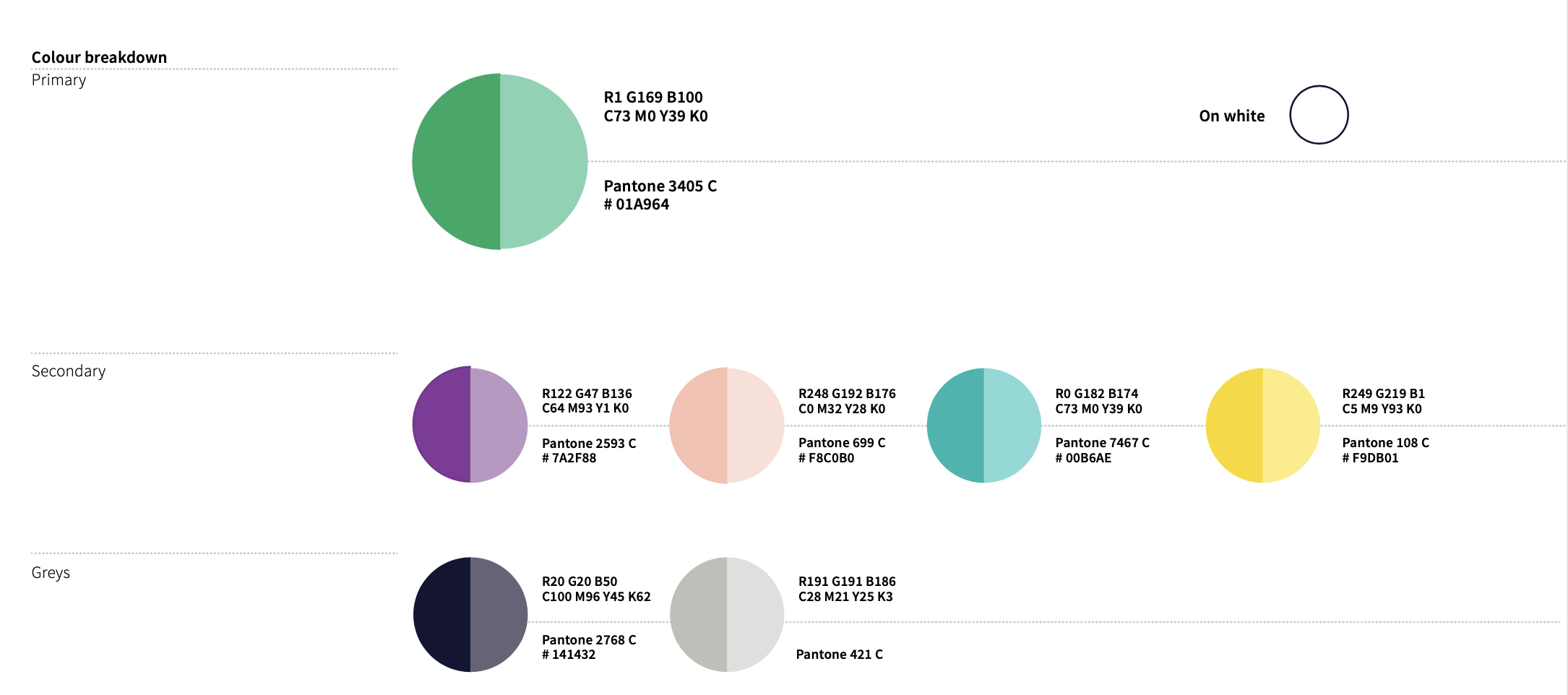
Accessible colours that represent our personality
Importantly, our platform needs to be accessible for everyone. The new Commonplace branding, uses a distinct and playful colour palette that can be used within our platform and communications. When possible, we aim for maximum accessibility. That's why, as part of this branding piece, we have ensured that any colour contrast combination we use moving forward will try to meet AAA or AA criteria:
People and places
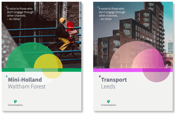
Building better places happens through engaging with people and it is important that people and imagery of the places they have helped to sculpt feature throughout our work. Real world photography with energy and a strong feeling of location is the foundation of all of our future communications.
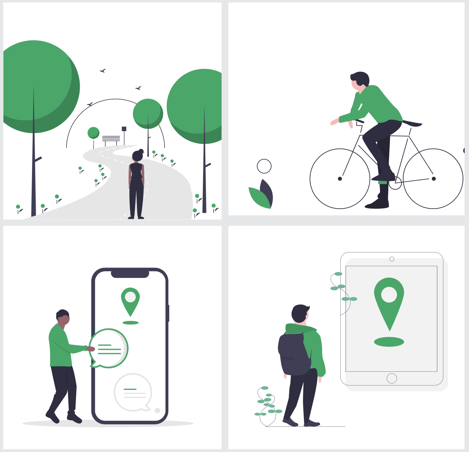
Easy to understand illustrations
The images we use are clear and simple. They strive to tell a story and highlight people making the best of the places they live, work and love. We chose to include a clean, simple illustration style to help compliment photography and demonstrate the product in a slightly more conceptual way. All illustrations include people involved in community activities or engaging with our technology: