.png)

3 min read
It is said that the measure of brilliance is the ability to adapt. With this in mind, today’s product update touches on the flexibility of the Commonplace platform and illustrates how brilliant your engagement projects could be if you adapt them to cater to the needs of your communities. From improving navigation around project pages to increasing interactivity, we’ve taken your feedback and have adapted the Commonplace 2.0 platform, making it easier for you to put your personal stamp on it, and encourage your visitors to engage more.
So, how is this done?
The answer is, in very different ways, depending on the vision and objectives you have for your engagement projects. Our recent blog post about the multi-language feature presents just one of the ways you can tailor your project to better engage your communities, but if your objectives are around usability, it could be as simple as changing the categories available in your project's navigation bar.
Here’s how a few of our customers have already made use of this:
Original Navigation Bar:

Customised Navigation Bar(s):

As you can see in the above examples, the icons and 3 of the 5 navigation tabs are fully customisable based on your engagement hub or project needs. This ensures respondents can easily find key information on the site and any supplementary details. As the site evolves, these can be adjusted for the subsequent stages to simplify and add value to your audiences over time.
Improving engagement is as much about design as it is about content. That being said, your project could be lacking some important information or pages to help your project visitors better understand what it’s all about. The examples below show how clients have used the flexibility of these pages to support increased understanding for community and stakeholder audiences.
Not yet on Commonplace 2.0? Get in touch to switch over.

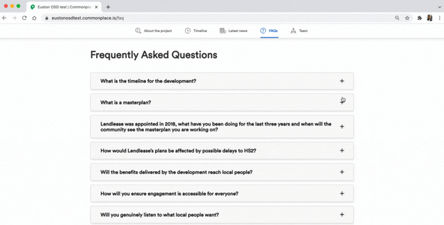
FAQs
Often, when running engagements, you’ll find community members asking similar questions. This is where an FAQ page would come in handy. Our customer, Lendlease, decided to incorporate an interactive FAQ page into a project they are launching soon. This section will be used to address local concerns that had already been expressed and in anticipation of other possible queries.
Glossary
As an existing customer you’re probably already doing a fantastic job of making the written content on your project pages clear and may not need a glossary. However, sometimes organisations and concepts you refer to may be foreign to your communities, so it is indeed better to be safe than sorry.
Cairngorms National Park Authority wanted to ensure their visitors understood the concepts they were consulting on so took the time to explain what terms like ’Affordable Housing’ and ‘Climate Emergency’ referred to. This makes sure concepts are clear to those contributing and educates the community as they progress the project.
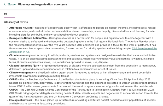
Have a think about the communities you cater to. Could they benefit from a glossary page like this?
Speak to the team to see how you can get this set up.

A Case Study
The beauty of customisation is there are many options to explore. Cairngorms National Park Authority shows what customisation of the project could look like at one end of the spectrum (for the technically minded, these customisations use of CSS, a rule-based language called Cascading Style Sheets). They saw an opportunity to align the user experience on our platform, with their other platforms, and made the flexibility of the Commonplace platform work for them.
.gif?width=810&name=Copy%20of%20Dual%20language%20asset%20(1).gif)
Our customer wanted to produce something of a high standard, engaging, easy to navigate, regardless of where the users were on the page, accessible and super interactive. In order to achieve that some custom edits were made. The Glossary and supporting documents were moved up the navigation ribbon, as opposed to placing them in tiles. This would have required customers to have to scroll endlessly in order to find what they were looking for. Another way Cairngorms National Park Authority did this was to incorporate links throughout the text to enable the user the ability to get to the bottom of the page more easily.
If you look closely, you’ll also note some variation in the fonts used. Branding is key when creating familiarity with users, and it was important for Cairngorms to replicate their title fonts on their project page, as well as brand specific images and dimensions. They wanted there to be a common thread throughout the page and this has cleverly been achieved through their images...
Cairngorms also made use of the expanding modules, to increase interactivity on the page. As part of the user experience, it was a priority for as many elements of the page to be engaging as possible.
There’s more to explore...
We have a number of other customers who have projects in production, who are exploring the flexibility of Commonplace 2.0. If you are yet to move on to the new version of our platform and have a new project to launch, there is no better time to see what it has to offer.
Get in touch with the team to see how you can take your page to the next level.